 |
| Link to Google Earth Gadget |
I found this handy Google Earth gadget by Zoltán Büki that can be used to show the effects of rising sea level for any coastline in the world;
Rising Sea Level Animation. Its meant to show the effects of rising sea level from melting polar ice, but in the parts of the world that have experienced falling relative sea levels since the end of the last ice age, like much of northern Canada, it can be used to reconstruct past shorelines.
 |
| The pink overlay is the coastline 4 meters higher than present. I'm trying to show that Maritime Archaic Indian sites located in the red circle in the middle of the map would have been on an island when they were occupied 4500-3400 B.P. |
Its simple to use and its accuracy seems fairly sharp, especially if you are looking at an area with hi resolution Google Earth coverage and a relatively simple coastline. When you first download it, by clicking on the "Open in Google Earth" link, it is set up to run as an animation, but each frame is a layer showing the coastline in 1 m intervals from 1 masl to 100 masl. If you don't have Google Earth, it will help you download and install it. Once its downloaded and the Google Earth program has opened, check your side bar and look in this folder;
- Temporary Places
- > Rising Sea Level Animation
- >> Changing Sea Level by 1 m by BZoltan Hungary
- >>> Data 1-100m
 |
| Google Earth Sidebar |
Unclick the check box in front of the "Data 1-100m" folder. Then you can click each layer individually. I'm interested in mapping the coastline around some Maritime Archaic Indian sites at Bird Cove on Newfoundland's Northern Peninsula. They were occupied when sea level was 4-5 meters higher than it is today, so by clicking those layers on one at a time, I can get a quick glimpse of the Maritime Archaic Indian coastline. The app doesn't tell you what past sea levels were, so if you are going to look at it to reconstruct ancient coastlines, you would need to know the rate of emergence for the area that you are interested in.
Each level in the application is a sphere wrapping around the entire globe. The lowest level is a sphere 1 metre higher than present sea level and the largest sphere is 100 metres higher, so it allows you to visualize coastlines anywhere from 1m to 100m higher than present. Unfortunately, it doesn't help with lowering sea levels and mapping coastlines that were lower than present. The default colour of the spheres is pink. I'd love to be able to change that if some knows what button to click.
 |
| The same area, using Canadian Digital Elevation Data from Toporama. I think the shape of this Island (with the red circle) is more correct than the one generated by Google Earth, although it took a little more work to make this map. |
For comparison, the map above is one I made of the same area using the Canadian Digital Elevation Data available on
Toporama. I traced the 4 meter contour interval by hand on screen to make this map. There's a little bit of labour involved, but I couldn't do it automatically because the part of the map that I'm most interested in connects the ocean coastline to a freshwater pond to create an island. Incorporating freshwater features into sea level models is something that these programs seem to have trouble doing on their own. I feel a little more confident about the results from the Toporama map, because it matches my memory of the actual lay of the land a little better. For this map, I'm trying to illustrate how Maritime Archaic sites located in the red circle would have actually been sitting on a small island when they were occupied. Today they are on the mainland. Generally, both maps illustrate that point, although the Google Earth app distorts the shape of the island a bit. Interestingly, the maps generated in Google Earth for 2-3m above sea level match the 4m map from Toporama more closely than the 4m map it produced. If Toporama and Google Earth are out of sync by 1 or 2 metres, but otherwise the same, then it might just be that they use a slightly different definition of sea level.

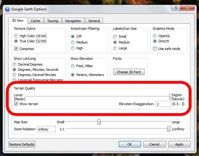
I forgot to mention - you can improve the results of the Google Earth gadget by opening Tools >> Options and dragging the Terrain Quality slider all the way to the right to create higher terrain quality. Also, you can try increasing the Elevation Exaggeration in the same window.
Photo Credits:
1-3,5: screen grabs from
Google Earth.
4: map based on data from
Toporama.


 PDF
PDF
This is awesome Tim! Very useful :) Perfect Christmas gift for those hard to shop for archy's.
ReplyDeleteAinslie
Plus its free! Er - I mean - Merry Christmas everyone I hope its your size!
ReplyDeleteIts especially fun playing with it on sites farther north when you can crank it up to 50 or 60 masl and send all those mountaintop pre-Dorset sites out onto islands where they belong.
Really neat Tim - I'll be downloading the GE tool.
ReplyDelete