Showing posts with label Mapping. Show all posts

Friday, July 12, 2013

Rain Days

The job doesn't stop when the weather won't let us work outdoors.  There's cataloguing, data entry, and mapping to keep us busy in the office.
Photo Credit: Tim Rast

Wednesday, June 12, 2013

Tracking Elfshot Artifact Reproductions, Part 2

Harpoon heads
In an earlier post, I showed a set of artifact reproductions that I was commissioned to make by a design and fabrication company in British Columbia for installation in Nunavut.  The client was the Kitikmeot Heritage Society in Cambridge Bay.  You may recall that Cambridge Bay was in the news last summer because Google was doing street view mapping of the community using a tricked out tricycle with a Google camera mounted on top.

Harpoon heads and art on display in Cambridge Bay
While they were in town, Google did some interior mapping as well, including the inside of the May Hakongak Community Library and Cultural Centre, where there are several exhibit spaces showcasing local history and artifacts.  Many of these artifacts are on loan from the Canadian Museum of Civilization or the Prince of Wales Heritage Centre, but a handful are reproductions that I made in 2011. For example, you can see the harpoon heads in the top photo in the display case in the photo on the left.  Its an interesting tour - especially if you go upstairs and see the kayak and cases full of artifacts.

In this case, I made the whip and the dog muzzle sitting in the lower right foreground.

Photo Credits:
1) Screen capture from 3DS Kitikmeot Portfolio http://3dservices.com/portfolio/kitikmeot-artifacts

Friday, January 4, 2013

3D Air Photo Maps

The field reports are getting a new type of map this year.  In addition to the usual line drawing site maps and feature plans, I've been working on some 3D renderings that combine our field drawings, total station data and government air photos.  I've been using Surfer for the past decade or so to make 3D surfaces based on data collected via total station or theodolite, but older versions of the software didn't allow raster images to be draped over the 3D wireframes.  But this summer, Corey and John figured out how to combine air photo base maps with 3D surfaces.


These are not models -
 this is John and Corey solving a
problem with knives.
These models give a quick visual reference of how the features in a site are arranged across the landscape and the details in the air photo give the viewer a good sense of the variations in terrain.  They are turning out to be particularly useful in visualizing the past environment.  The sites that we are working on have experienced as much as 50 metres of isostatic rebound since they were occupied 3 or 4 thousand years ago.  Assuming that they were originally situated close to their contemporary shorelines, I can reconstruct the sea level as it would have been when the sites were occupied.  A new landscape emerges - with hills separating into islands and valleys that are today half a kilometre inland becoming tombolo beaches.

The blue shading indicates a possible coastline that is 55 metres higher than the modern shore. The site at the top of the image (ObFt-6) probably sat on a narrow tombolo beach when it was occupied, but today it is 375 m inland from the coast on a high ridge nestled between two hills.
As the land emerged, the sea level fell and ObFt-6 was probably a less attractive place to camp, compared to the new beach around the corner at ObFt-5.


Lori collecting location and elevation
data with the Total Station
Now that we know how to combine the air photo raster images with the 3D surfaces, its a relatively simple process to create these composite maps using data that was already collected in the field and prepared in the lab.  To make these maps from scratch would involve a fair bit of work, but since we've collected the data and used it in other ways already, adding this step is a relatively painless way to create some attractive and informative new visuals.

The air photo and map data come
from existing layers in Adobe Illustrator
I create the skin that I want to drape over the 3D surface in Adobe Illustrator and export it as a .tiff.  The units we excavate, the air photo and the lines showing the different landform boundaries exist as different layers in Adobe Illustrator, so its in that program that I have to decide what details I want to include on the surface of the map.  I also need to know exactly how far north, south, east, and west the image extends from our site datum so that I can tie it into the total station data.  The .tiff exported from Illustrator is used as a base map on a plot in Surfer 10.  When I bring it in I need to change the image coordinates so that they match the area covered by the elevation data collected with the total station.  Then I can add a 3D surface of the corresponding X,Y,Z total station data.

The air photo and 3D surface are combined in Surfer.  In the floating window, I'm adjusting the colour and shading to indicate what the coastline may have looked like when the site was occupied.

The final labels are added in Adobe Photoshop. I'm trying to keep it simple, although this particular site has a lot of closely packed features.  The air photos that I have available are all black and white, so I'm using bright primary colours to show areas of excavation, detailed mapping and the ancient sea level.
If all of that is done correctly, I have the basic map done and then its just a matter of playing with different shading and colouring options.  I can rotate the model and find the best view to illustrate the site.  The sea level is simulated by manipulating the material colour of the 3D surface.  Surfer has some built in editing options, but I usually find the view that I like and export it as a .tiff again and use Adobe Photoshop to add the final labels to the image.  I'm trying to keep the labels to a minimum to avoid clutter and help with the visual impact.  The reports have many other clean, square site and feature maps to show details and precise measures and distances.

Photo Credits: Tim Rast

Friday, October 19, 2012

Putting Tick Marks on Contour Lines

You know those little tick marks that you put on contour lines to show the direction of slope?  Here's a confession, every year for the past 15 or 20 years, I've been adding those lines to maps individually, one at a time, with Photoshop or Adobe Illustrator   I'd draw one tick mark and copy it a bunch of times and then rotate and place each one manually.  Maps made at the end of the day or later in the week had fewer and fewer tick marks spaced wider and wider apart.  But not anymore, here's a trick to make those tick marks perfectly consistent and much simpler. I'm using Adobe Illustrator in this example, but it should work in any vector graphics program that lets you make dashed lines.  (click on the images to make them bigger)

I want to add the little tick marks to the contour line looping around the word "Bedrock". I've clicked on it with the "Selection Tool", which is why its highlighted blue.  Once its selected, Copy It - I usually just use CTRL C.


Paste a copy of your line onto your map.  I like to use CTRL F so that it lies exactly on top of the original line and I usually put it on a separate layer, but that's optional.  I've moved it a little bit in this image so you can see it next to the original line.

Change the weight of the line.  You can make it any weight you want - the thickness of the line will be the length of your tick marks.  I made my 7 points.

Now make your solid line a dashed line.  The default setting will usually be evenly spaced dashes and gaps. Also, its important that you select "Butt Cap" for the end of your line.  The other end cap styles will make circles or rectangles rather than nice thin lines.

To create the individual tick marks, change the spacing of the gaps and dashes. I like using 1pt for the dashes and 20 pts for the gaps. 

On a simple line, without any major curves you can just move the dashed line next to the original line and you're done. On a more complex line, like the one in the example, you may have to scale the line up or down so that it matches the original curve.  You can use the bounding box to drag the line, or the scale function to increase or decrease the size of the line.

Sometimes the line doesn't fit exactly, so you may need to use the Direct Selection Tool to select and move individual nodes or line segments.  Even on the most complicated contours, I find that I can usually get 80-90% of the line to fit just by scaling or using the bounding box, this is really just for small tweaks.

That's it, its done.  On a simple line this takes a few seconds.  On a complex line, it might take a few minutes.

Photo Credits: Screen Grabs from Adobe Illustrator

Wednesday, October 10, 2012

Mapping Again

Lines and labels from the paper map
 overlying the air photo.
This fall, I'm making the site maps from the summer's work.  The purpose of these maps is to show the distribution of structures and features across the site, the areas where our mapping and excavation took place and provide some details of the landscape that the site is located in.  The information for these maps comes from air photos, data recorded with a total station, and paper maps drawn in the field.

This layer has contour lines created from
 elevation data collected on site using a total station.
I'm combining the different sources together in Adobe Illustrator and trying to pull the most relevant and accurate information from each of the different sources into one clear image that represents each site and the work that we did there.  As a bit of a bonus, this year John and Corey figured out the steps to georeference our air photos and paper maps to our total station data in Surfer so that we can drape the photos and maps over a 3D wire frame, so I'll also be able to use some 3D landscapes to put the sites in context.  I'll share some of those as they get done.

I still like making paper maps in the field, although good quality gridded graph paper is getting very hard to find. The local drafting supply shop loves telling me how nobody uses it anymore whenever I try to buy it from them.
 Photo Credits: Tim Rast

Monday, January 16, 2012

I love it when a plan map comes together...

It looks like I'm finally through the worst of the mapping.  I finished up the last of the 79 site and feature maps required for the report this afternoon.  I still need to print them out and see if they work on paper, but I'm almost done with building the pieces of the report and sticking them in place.  After that it should just be editing it all together and then booting it out the door.

The artifacts are all labelled, although I need to take a few more photos of them and make sure that everything is organized and ready to send off for curation at the Prince of Wales Northern Heritage Centre in Yellowknife.  Those few photographs should be about the last pieces that I need to build the report.  From then on, it will just be organizing and editing.

Photo Credits: Tim Rast


Wednesday, January 4, 2012

Back at my Desk

More maps...
I'm back to the maps again.  I've finished all the site maps and all the feature maps for sites where we didn't excavate or find artifacts.  Now I'm going through the bags of artifacts and finishing up the artifact catalogs.  Once all the artifacts are accounted for, labelled and measured I plot them on their respective feature maps.

The maps have deeper stratigraphy than the sites
Since October, the end has always seemed about 4-6 weeks away. Hopefully this is the final pass through the maps.  All the rocks are digitized at this point, its just a matter of layering the artifacts in, cleaning up the lines and adding the legends, scales, and other necessary labels.  I have about 50 site and feature maps completed and there are another couple dozen feature maps left to do.  Now it seems like the end is about 3-4 weeks away.

A friend sent me this picture of me in the field. Somehow the fieldwork makes all this report writing worthwhile.  I forgot how protective I get of my lunch during the summer.

Once its in the thermos, its my coffee.

Photo Credits: 
1,2: Tim Rast
3: Claire St-Germain

Wednesday, December 7, 2011

Building Up Site Plans

Illustrating the layout of the site
I'm working on site plans at the moment.  These maps show the distribution of archaeological features, excavations and test pits across the site.  Hopefully there will be enough topographic information included that you can place those features into their local landscape.  They should give you a sense of the setting of the site and what archaeological investigations have taken place there.

Each little square in the grid is 1 x 1 m, and each heavier square is 10 x 10m


A tent ring and two 2x2m units
I'm working in Adobe Illustrator to combine information from a lot of different sources into one (hopefully) concise and cohesive map of each site.  I'm copying and shrinking the feature maps that I was tracing a few weeks ago and dropping them into their correct positions relative to each other and the landscape.  The landscape information comes from site plans collected in the field this summer or in previous years.  By law, in Nunavut, you can't excavate a site in the same year that you find it.  That means that the sites we were digging this year were found, mapped, and recorded in previous field seasons, so I almost always have some good map data to start with.

On this layer I'm adding some radial information. I have the angles and distances recorded to each test pit from the southwest corner of the tent ring we excavated.
The greenish square is a scan of the paper map we drew in the field.   It includes the distribution of archaeological features as well as the frost cracks, which were useful in tying the site into the air photo to help fill in the overall shape of the elevated beach terrace that the site was sitting on.


Luckily we have some hi-res air photos of the area
When I don't have detailed site plans to work from, I like to build my maps off of air photos.  I record enough landmarks in the field to tie the site into aerial photographs.  Then, working from the air photos, I trace out the landscape features that are prominent and would be easily recognizable by someone unfamiliar with the site.  In the map I'm working on today there is a prominent system of frost-cracks, criss-crossing the site.  Those cracks show up on the ground and air photos and anyone holding the finished map should be able to orient themselves on the ground by following the cracks.

This is a view of the site from the lower left (southwest) corner of the map.  You can orient yourself using the pattern of linear frost cracks.  This terrace is a raised beach ridge and the high tide line has dropped about 30 meters and moved 700 metres north since the site was initially occupied.
Photo Credits: Tim Rast

Wednesday, November 9, 2011

iDraw Archaeological Features on the iPad

Tracing Rocks in iDraw
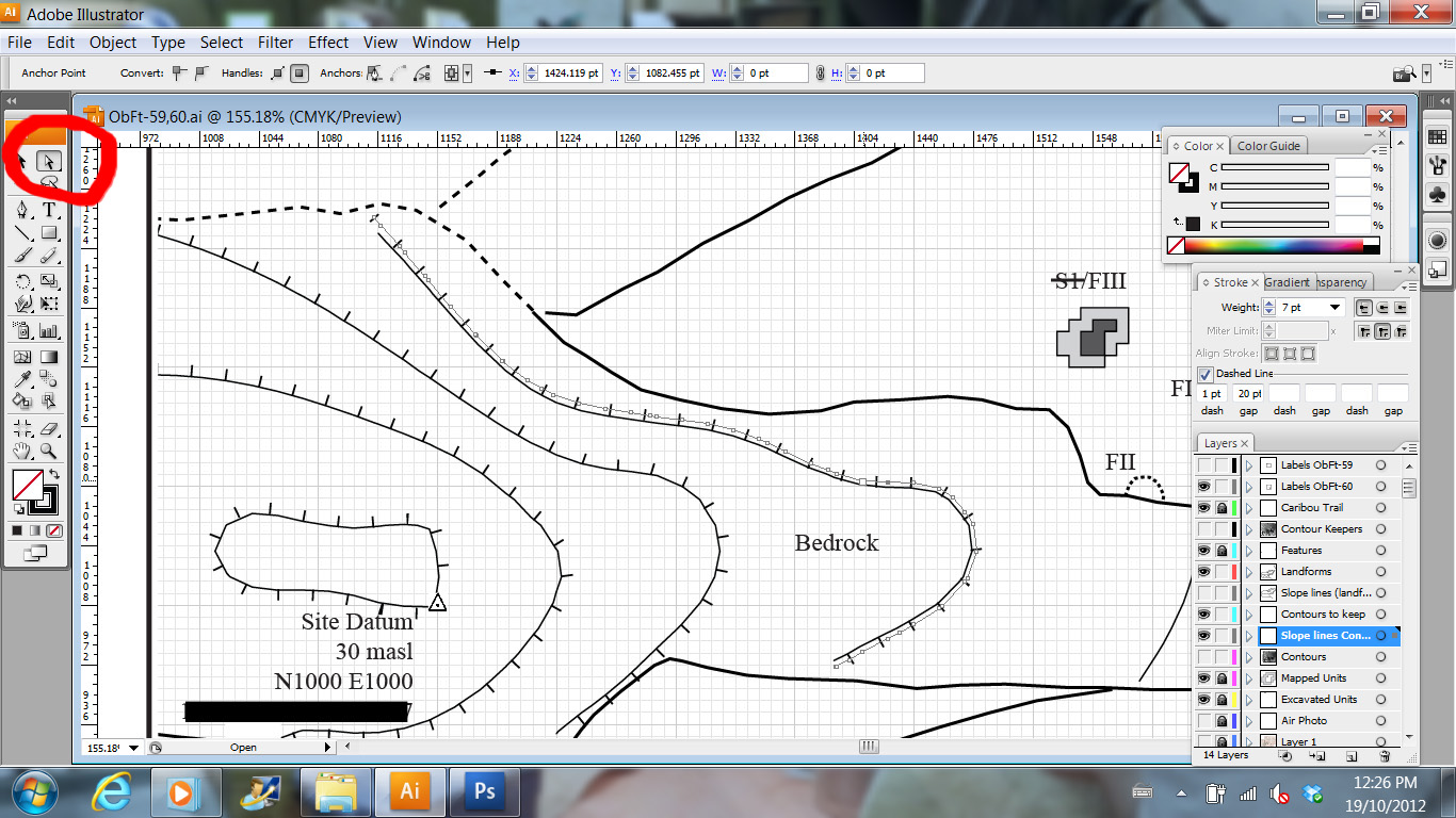
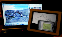
On screen digitizing took a turn for the fun this past week when I started using the iDraw app on my iPad to trace feature maps for the report I'm working on.  After more than two weeks of point and click tracing in Adobe Illustrator with the mouse, the switch to the stylus and iDraw seemed like a vacation.  I feel like a kid who gets to do all my homework for the next week on an etch-a-sketch. Fun!

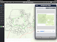
The green insert shows the scanned paper map
iDraw is excellent for tracing drawings or maps which can be scanned as a single .jpg.  Many of the feature maps that I used Adobe Illustrator for were stitched together from many small overlapping maps.  Some of the rocks that I was tracing were represented on more than one hand drawn map and I wanted to be able to flip between all those different source layers as I made the final digital version.  You can't do that on iDraw, yet.  As far as I'm aware, you can only have a single .jpg as your base layer.  That limits the number of maps I can digitize this way, but for the ones that do fit into this category, the program works great.

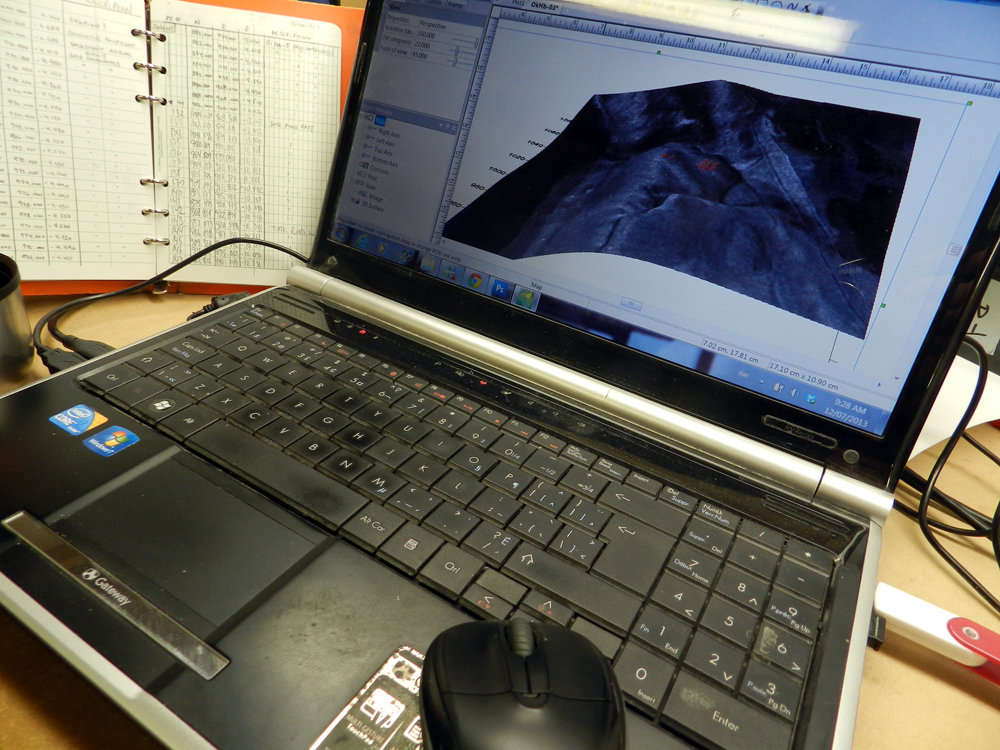
A photo of the feature, iDraw profile, source .jpg
iDraw is a vector drawing program, comparable to a streamlined Adobe Illustrator or Corel Draw.  You work in layers and all the information that you create in the app can be imported into programs like Adobe Illustrator as .pdf or .svg files.  There's a bit of a hiccup in opening the files in Illustrator on a PC, but once you know to expect it, its not that much of a hardship:  The individual layers from iDraw have all disappeared and all the information from each layer is grouped together into one layer.  At first it looks like you've lost all the layer info, but that's not really the case.  All the objects from each layer are locked together into separate groups, so you can select the contents of each iDraw layer with a single mouse click and copy them into a new Illustrator layer.  My maps are fairly simple at this point, with only 3-6 layers, so it only takes a few seconds to select each group of objects and paste them all onto their own layers again.  I'm not sure if this happens when opening iDraw files on a Mac.

This took less than an hour to trace
My first impression of using the iPad as a digitizing tablet is that its not as blisteringly fast as I was anticipating.  Drawing is faster, but only slightly quicker than using the mouse.  However, its so much more intuitive and comfortable to use than I was expecting, that at the end of the day, I have more maps done than I thought.  I don't dread starting the really big complex maps, because I know I won't be trapped in a chair at a desk all day.  My earliest experience with digitizing maps was using a puck on a big drafting table in a university computer lab.  With the iPad, you could do the same thing in a park or a big comfy chair.  Its a more enjoyable experience, so I take fewer breaks, so I get more work done in less time.

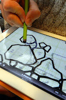
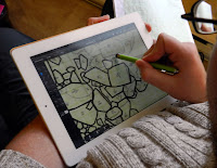
Stylus improves accuracy
I think one of the reasons that the actual digitizing is a little slower than I expected is that I haven't figured out how to turn off the auto rounding on the continuous draw Pencil.  I can't just trace around the rocks in one swipe, because the line doesn't want to close itself into a continuous polygon and iDraw smooths out the curves into an artistic flourish.  To accurately trace the rocks you need to tap, tap, tap with the Pen and connect the dots.  Its not hard, its just slightly slower.  Although I do like the Pencil's artistic flourishes for going back and quickly adding surface details to the rocks to give the illusion of a 3D object, rather than just a hollow polygon.  Its very easy to zoom in and out of the drawing for more detail on tricky places, but its still a good idea to use a stylus to help with your accuracy.

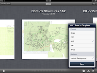
I find moving file with Dropbox simplest
I want to integrate the maps done on the iPad with the other maps that I did in Adobe Illustrator, so I'm not finishing the maps in iDraw.  When I get all the information traced off the base map I save it to my Dropbox folder and by the time I walk over to my laptop, its there waiting for me.  I'll do my final tweaking, scaling and labelling in AI.  Even with transferring files between platforms and programs, its still faster and more enjoyable to do as much of the grunt work on the iPad as possible.  For next season's work, I'll be thinking of ways to make more field drawings suitable for digitizing on the iPad.

Photo Credit:
1,5: Lori White
2-4,6: Tim Rast

Wednesday, November 2, 2011

I'm an excellent tracer

On Screen Digitizing
So, at work, I'm tracing.  I've been tracing tent ring rocks for the past couple of weeks and I probably have another week or two left.  If I was trying to impress an old classmate, I might call it "on screen digitizing", but really I'm just tracing.

Lori mapping a 1 x 1m unit
 I'm making the feature maps for this summer's final report.  When we excavated the sites, we mapped each 1 x 1m unit that we dug.  We excavated between 50 and 100% of each structure, so depending on the size of the feature, there are anywhere from 1 to 25 individual 1 x 1 m unit maps to stitch together and trace for each tent ring or dwelling.  I'm doing the stitching and tracing in Adobe Illustrator.

Binder full of Unit Plans
The two fat binders of level records were scanned in the field on rain days, so that saves a lot of time this fall.  I'm opening up all of the scanned unit plans, cutting the maps out and pasting them into a new Illustrator document were I finish scaling and fitting them together.  We mapped the unexcavated areas of each feature as well, so those also need to be copied into the new document.  Once everything is in the right position I make a new layer and trace around each rock with the mouse.  Its pretty tedious work.

The tent ring s starting to take shape
I have another stack of feature maps to trace that don't have to be stitched together from multiple sources and I'm going to try tracing those on the iPad.  I'm looking forward to that.  In the meantime, if I go back to posting more vacation photos, I hope you'll forgive me, but you really don't want to see a month of on screen digitizing posts.

This tent ring map was stitched together from 11 hand drawn field maps and is ready for scaling and labeling.  The two squares outline the 8 sq. m that we excavated and the rocks outside those squares were mapped separately. 
Photo Credits: Tim Rast

Wednesday, October 5, 2011

Open Street Maps for Garmin GPS

In a few hours, I'll be on a plane heading to Bilbao, Spain.  We spend a bit of time in Spain's Basque Country before starting a cave and wine driving tour of southern France.  We booked the car a couple weeks ago and I promised to provide the maps so we wouldn't have to pay extra for an on-board GPS.  I said that I'd bring my Garmin GPSmap 62s loaded with all the maps we'd need.  Then I forgot about it.

I started looking for the maps a few days ago and quickly ruled out buying them - the official Garmin Topo maps of Spain and France are over $600 US.  I didn't really want to pirate them, but while searching some of the back alleys of the internet I found out about OpenStreetMap, which is a kind of cartographic wikipedia.  There are a few ways to play with and download the maps on OpenStreetMap itself, but to get them onto your Garmin GPS you need to checkout another site called: Free routable maps for Garmin brand GPS devices (garmin.openstreetmap.nl). Which is free and awesome.

Selecting an area around Bordeaux
The interface on garmin.openstreetmap.nl is simple and the instructions are easy to follow.  To select the maps you want all you have to do is highlight them on the big blue map of the world.  You can pick one tile or several.  When you have the maps selected all you need to do is enter your e-mail address and click "Build my Map".  Your map request is added to the queue and you are sent an e-mail with a link to check on its progress.  I've used it twice and the first map set was supposed to take an hour or so to build and it was actually done in about nine minutes.  My second map took closer to the promised hour.  When your map is ready to download you are sent a link with several download options.  I picked the "Installer for Garmin Mapsource" option and it took 5-10 minutes to download my map and another 5 minutes to install it.  When it was installed I could add it to my GPS from Mapsource or Mapinstaller.

Free OpenStreetMap from garmin.openstreet.nl of Bordeaux, France.

The same area from Garmin's TOPO France v.2. Not free, at all.

The resulting map looks great.  I haven't had a chance to ground truth it yet, but in Mapsource, it looks as good or better than the $600 Garmin product.  However, I did notice that when I downloaded and installed a second set of maps it overwrote the first set that I'd download, even when I changed the folder name. If someone figures out a way to fix or avoid that, I'd be grateful.  Even so, I'm definitely keeping  Free routable maps for Garmin brand GPS devices (garmin.openstreetmap.nl) in my bookmarks.

Photo Credits: 
1) Tim Rast
2) Screen grab from garmin.openstreetmap.nl
3,4) screen grab from Mapsource on my computer.


Related Posts with Thumbnails