The field reports are getting a new type of map this year. In addition to
the usual line drawing site maps and feature plans, I've been working on some 3D renderings that combine our field drawings, total station data and government air photos. I've been using Surfer for the past decade or so to make 3D surfaces based on data collected via total station or theodolite, but older versions of the software didn't allow raster images to be draped over the 3D wireframes. But this summer, Corey and John figured out how to combine air photo base maps with 3D surfaces.
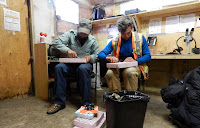 |
These are not models -
this is John and Corey solving a
problem with knives. |
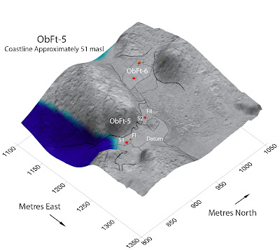
These models give a quick visual reference of how the features in a site are arranged across the landscape and the details in the air photo give the viewer a good sense of the variations in terrain. They are turning out to be particularly useful in visualizing the past environment. The sites that we are working on have experienced as much as 50 metres of isostatic rebound since they were occupied 3 or 4 thousand years ago. Assuming that they were originally situated close to their contemporary shorelines, I can reconstruct the sea level as it would have been when the sites were occupied. A new landscape emerges - with hills separating into islands and valleys that are today half a kilometre inland becoming tombolo beaches.
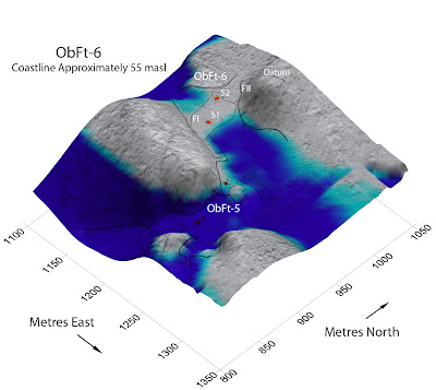 |
| The blue shading indicates a possible coastline that is 55 metres higher than the modern shore. The site at the top of the image (ObFt-6) probably sat on a narrow tombolo beach when it was occupied, but today it is 375 m inland from the coast on a high ridge nestled between two hills. |
 |
| As the land emerged, the sea level fell and ObFt-6 was probably a less attractive place to camp, compared to the new beach around the corner at ObFt-5. |
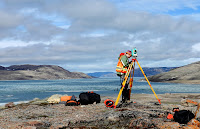 |
Lori collecting location and elevation
data with the Total Station |
Now that we know how to combine the air photo raster images with the 3D surfaces, its a relatively simple process to create these composite maps using data that was already collected in the field and prepared in the lab. To make these maps from scratch would involve a fair bit of work, but since we've collected the data and used it in other ways already, adding this step is a relatively painless way to create some attractive and informative new visuals.
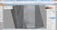 |
The air photo and map data come
from existing layers in Adobe Illustrator |
I create the skin that I want to drape over the 3D surface in Adobe Illustrator and export it as a .tiff. The units we excavate, the air photo and the lines showing the different landform boundaries exist as different layers in Adobe Illustrator, so its in that program that I have to decide what details I want to include on the surface of the map. I also need to know exactly how far north, south, east, and west the image extends from our site datum so that I can tie it into the total station data. The .tiff exported from Illustrator is used as a base map on a plot in Surfer 10. When I bring it in I need to change the image coordinates so that they match the area covered by the elevation data collected with the total station. Then I can add a 3D surface of the corresponding X,Y,Z total station data.
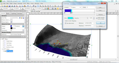 |
| The air photo and 3D surface are combined in Surfer. In the floating window, I'm adjusting the colour and shading to indicate what the coastline may have looked like when the site was occupied. |
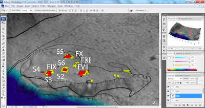 |
| The final labels are added in Adobe Photoshop. I'm trying to keep it simple, although this particular site has a lot of closely packed features. The air photos that I have available are all black and white, so I'm using bright primary colours to show areas of excavation, detailed mapping and the ancient sea level. |
If all of that is done correctly, I have the basic map done and then its just a matter of playing with different shading and colouring options. I can rotate the model and find the best view to illustrate the site. The sea level is simulated by manipulating the material colour of the 3D surface. Surfer has some built in editing options, but I usually find the view that I like and export it as a .tiff again and use Adobe Photoshop to add the final labels to the image. I'm trying to keep the labels to a minimum to avoid clutter and help with the visual impact. The reports have many other clean, square site and feature maps to show details and precise measures and distances.
Photo Credits: Tim Rast


they look really great Tim!
ReplyDeleteThanks Ainslie. I think they'll be useful. It really helps visualize how some areas were used and re-used over time.
ReplyDeleteNow we have many apps to use with GPS and maps with Android apps and others, Technology facilitates humans to investigate and learn
ReplyDelete